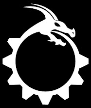
Not much time has passed and I've already revised the icon I did. I like the revised version better. The first version didn't seem as fluid as I had hoped. I wanted it to look like the gear was changed into the dragon.
Also when I sized down the icon it was very hard to distinguish much. It is still not the most clear icon at small sizes, but it's much better with this design.
It still doesn't feel like my final design, but it feels closer.

I like the dragon. I was hoping I could borrow it for a pendant I'd like to make. Please let me know if this is problematic. I work a renn faire booth in Californis. noirelindy@gmail.com
ReplyDelete